Psychology of colors in online casino games
When entering the world of online casinos and games, players are surrounded by a symphony of colors from every direction. If anyone ever thought this was an artistic mess or an unplanned composition, they would be very mistaken. The psychology of colors in online casinos and games is a distinct area of business.
Pulsating reds, glowing oranges, and flashing greens—all designed to capture your senses and sharpen your focus. This is no accident. Both physical and online casinos use the power of color psychology in their presented games and slot machines to create an atmosphere that excites and subtly influences player behavior. Today, we’ll explore key business facts behind game design on iGaming platforms and the color palettes that shape player experiences.
Introduction to color psychology in casinos
One of the brain’s many skills is its ability to adapt and respond to colors. Different wavelengths of light trigger specific reactions in the limbic system, an area related to emotions and memory. Understanding these reactions allows casinos and game studios to carefully select color palettes to evoke desired emotions in players.
How colors influence human behavior
Research in cognitive and behavioral psychology has shown that colors can trigger deep, often subconscious responses in our minds. When a person enters a casino, the interplay of hues and shades is designed to evoke specific emotional reactions and even alter perceptions of time and space. Studies by researchers such as Andrew Elliot suggest that even small variations in a color’s brightness or saturation can influence mood and decision-making processes. In this context, the careful orchestration of colors helps to reduce anxiety, enhance concentration, and subtly encourage behaviors that can extend a guest’s stay. This nuanced impact is not merely about making a space look attractive—it’s about engaging the brain’s natural responses to visual stimuli.
The role of colors in marketing and branding
In the cutthroat world of casinos, color isn’t just decoration—it’s a strategic tool that helps define a brand’s personality and create a memorable experience. When you step into a casino, you’re met with an environment that feels carefully curated; every hue and tone is chosen to resonate with you on a subconscious level. Research in color psychology has shown that our reactions to color are deeply ingrained, influencing how we feel and even how we behave without us realizing it.
Savvy casino marketers and designers tap into this understanding to craft spaces that not only catch your eye but also speak to your emotions. Instead of bombarding you with flashy, overwhelming visuals, they use a thoughtful palette to subtly communicate a sense of sophistication, energy, or trustworthiness. It’s a bit like a silent conversation—one where the colors set the mood and help build a connection with the guest.
The big three colors in iGaming platforms and online games
Red – instinct for survival and quick decisions
Red in color psychology is associated with stimulation. It increases energy and excitement, often encouraging fast decision-making. It’s no surprise that red is frequently seen on key CTA buttons like “Spin” or “Bet Now” in online games and physical slot machines. Red also induces physiological changes—it can slightly raise heart rate and adrenaline levels. In online gaming, red puts players in a more impulsive state, leading to faster betting decisions and a greater willingness to take risks. It’s also linked to dominance and power, subconsciously reminding players of the possibility of big wins. Studies have shown that playing under red lighting encourages riskier bets, higher stakes, and more frequent wagering.
Blue – trust your destiny
People naturally gravitate toward blue. It builds trust and stability. The gaming industry is divided on this. Most casino games avoid cool colors because they have a calming effect on players. However, adding blue in key UX areas, such as buttons or payment sections, can enhance the sense of security. Balancing stimulation (red) and security (blue) fosters positive emotions that players enjoy returning to. Live casinos often use blue for roulette and blackjack tables, helping to create a professional and trustworthy atmosphere.
Green – keep playing
Green is associated with prosperity and success, increasing the likelihood of players clicking on games since it signifies “continue.” In real life, green is widely recognized as a color that allows safe action. Game designers frequently use green in poker, a strategic game, as it boosts player confidence.
Supporting colors as unsung heroes in casino design
While the “big three” – red, blue, and green – dominate color psychology in online platforms, other shades play supporting roles:
Yellow and orange – have fun!
These warm and cheerful colors create a sense of optimism and carefree enjoyment, making games more engaging and entertaining. Yellow grabs players’ attention and sends a strong subconscious signal to “stop and look here,” especially when paired with red.
Purple – the color of wealth
Associated with luxury and exclusivity, purple, along with gold, often appears in VIP sections and high-roller areas, making players feel valued and important.
The shine of gold
Gold, widely recognized as a symbol of wealth and success, is the quickest way to emphasize luxury and exclusivity in a game. When players choose games dominated by gold—even from the avatar alone—they subconsciously associate this color with the promise of significant winnings and imminent riches. This psychological connection creates a sense of optimism and expectation, encouraging players to keep spinning the reels in pursuit of their golden fortune.
The art of combining colors
Game designers and iGaming platform operators rarely rely on just one color. Understanding player psychology means catering to various emotional needs to create a layered experience. For example, red and black together create a sense of tension and anticipation, perfect for games like roulette.
Color as a visual cue
Beyond setting the mood, colors serve as visual cues in slot machines. Game designers often use bright, contrasting colors to highlight key business elements. Winning lines may be displayed in bold yellow or flashing animations to help players easily identify their success.
Slot machines also use color variations to indicate special features or bonus rounds. When a scatter symbol appears in a different color scheme, it instantly draws players’ attention, signaling the potential for free spins or bonus rewards. These visual cues increase engagement and excitement, ultimately enhancing the platform’s LTV.
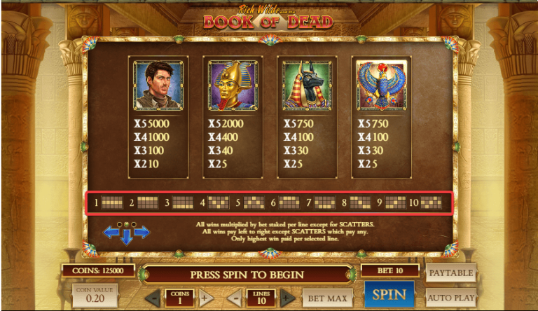
Book of Dead – case study
This analysis is based on a qualitative review of the game’s visual design. We will examine:
- iconography and symbolism – how key symbols utilize color to convey narrative importance,
- primary and supporting colors – the balance between dominant hues and their complementary accents,
- user interaction – how color choices guide attention and encourage specific actions, such as pressing the spin button.
Dominant palette and symbolic design
- gold and yellow as the foundation – the game’s visual space is dominated by rich gold and yellow tones. These colors evoke luxury, wealth, and timelessness—setting a scene that is both opulent and inviting,
- blue in Rich Wilde’s depiction – the Rich Wilde symbol is encased in blue—a color that communicates trust and reliability. This choice subtly reassures players, creating a sense of familiarity and confidence in their gameplay,
- royalty in the Pharaoh symbol – the Pharaoh is rendered with a blend of red, purple, and gold. Purple, traditionally linked to royalty, elevates the symbol’s status, implying that interactions with this element could lead to significant rewards,
- tranquility with Anubis – the Anubis symbol, traditionally portrayed as a guardian figure, incorporates calming green tones alongside black and gold. This combination encourages a focused yet relaxed state, essential for maintaining engagement during high stakes play,
- divinity in Horus – the Horus symbol combines gold and blue. Gold hints at eternity and wealth, blue suggests divine wisdom and luck, and the high-contrast elements capture attention, making Horus a powerful emblem of potential fortune.
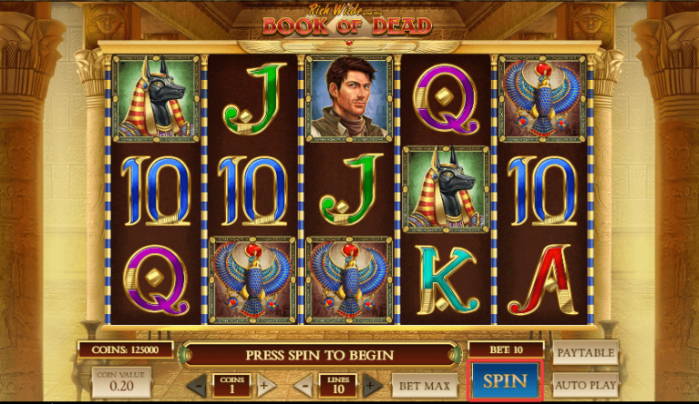
The spin button as a strategic element
Amid a canvas of predominantly golden hues, the spin button breaks the mold with a vibrant blue background and subtle golden inscription. This contrast is not accidental; blue’s associations with calmness and trust make the button both inviting and reassuring. It acts as a visual call-to-action, enticing players to engage with the game without overwhelming their senses.
The overall design harmonizes these elements, ensuring that no single color dominates but rather that each plays its part in a carefully choreographed visual narrative. The interplay between the primary palette and the supporting colors creates a balanced environment that is both dynamic and coherent, reinforcing the game’s thematic roots in ancient Egyptian lore.
Beyond visuals – a multisensory approach
Color psychology is just one piece of the puzzle. Casinos use a multisensory approach to keep players engaged. Upbeat music with celebratory sounds after a win creates a sense of achievement and encourages continued play. Dim lighting removes distractions and enhances immersion, much like movie theaters lowering the lights before a film begins.